

Enhancing The User Experience: Skeleton Screens vs. Loading Screens
Strategies, benefits, and best practices for effective content loading in UI/UX design


Introduction
With the advances in technology, digital products have been optimized for performance, from loading to execution, but despite this, the user has to wait at some point. The wait may be caused by a slow network, a slow machine, or fetching a lot of data from the servers. To keep users engaged and prevent them from leaving the site, screen loaders were introduced. From progress messages, progress bars, and spinners to skeleton screens, designers are spoilt for choice but they are often faced with the dilemma of choosing between skeleton and loader screens. Both serve the same purpose of enhancing the user experience during loading, but each has a different approach and impact on the brand and target audience. In this article, we will group them into skeleton screens on one end and loaders on the other end dig deep into the nuances of each, and understand when to choose what and when.
Skeleton screens
Definition and purpose
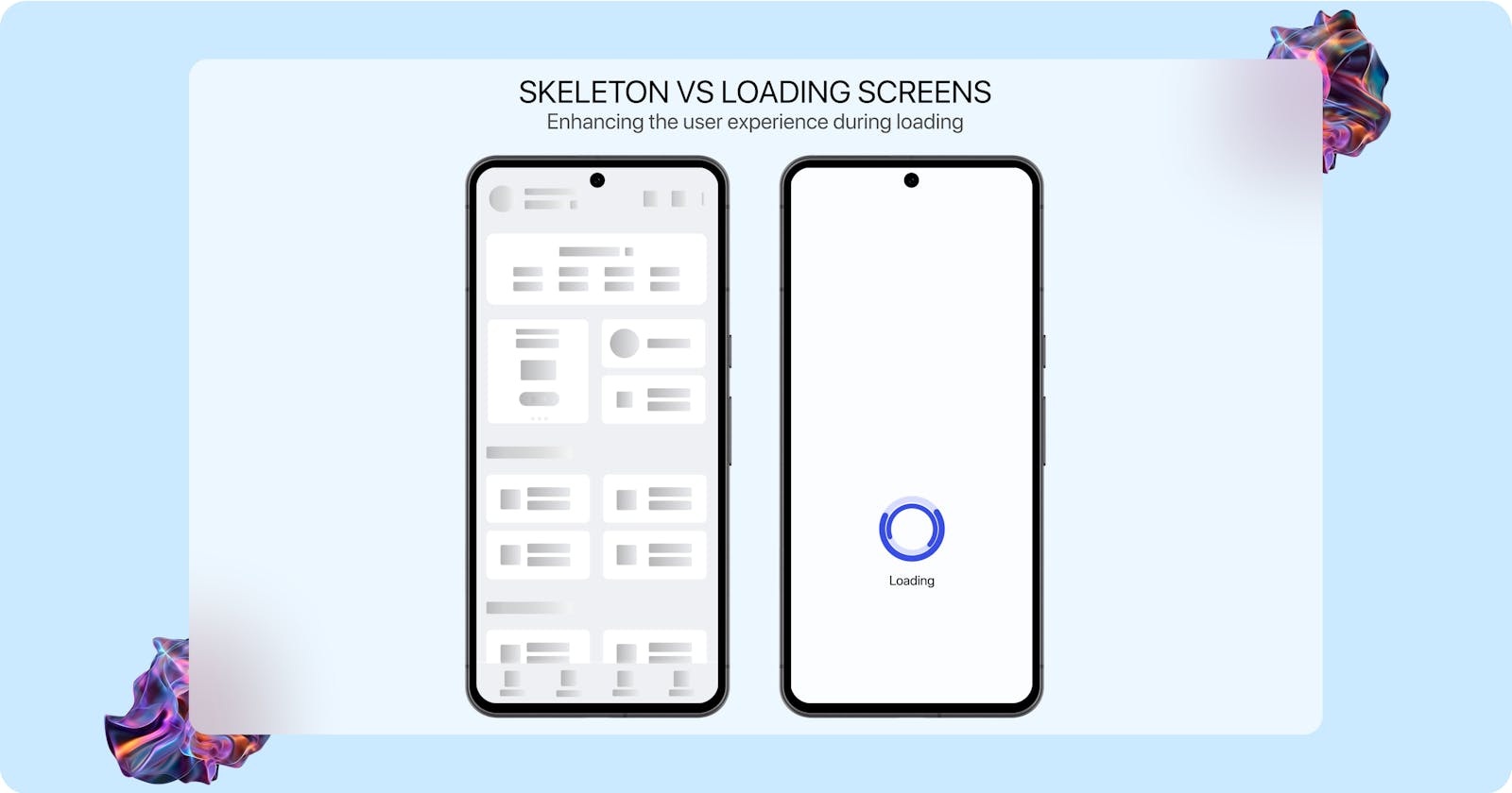
A skeleton screen is a static placeholder of the loading site that mimics the entire structure of the user interface beneath. They often feature light grey squares, rectangles, and circles or monochromatic outlines as a visual representation of where each piece of content will appear, the size, and type of content.
Luke Wroblewski introduced skeleton screens in 2013 in a blog where he talked about reducing perceived wait time. He explains how gradually revealing the content keeps the user busy and expectant and draws their attention from the loading time needed to display the contents of the site.
It is important to note that there is a difference between skeleton screens and wireframes, and the two should not be confused as the results can be catastrophic.
Skeleton screens are used to indicate a sense of progress and make the waiting experience more bearable.
Types of skeleton screens

Kevin Mehta in his blog post, Skeleton loader: An overview, purpose, usage, and design, states that there are 3 types of skeleton screens. The type of skeleton screen is named so because of the behavior of the placeholder it holds during loading and before the appearance of content.
1. Static placeholder. As the name suggests, not much happens in this type of skeleton screen.
2. Pulse placeholder. In this type, there is a low transition in the opacity of the skeleton screen. The opacity reduces and fills slowly during the loading process
3. Waving placeholder. This type has a gradient and/or shadow that moves horizontally across the content of the skeleton screen.
Benefits of skeleton screens
1. Seamless transition. After loading, each piece of content appears in the exact position it had initially appeared in as a placeholder. The size, shape, and type of content is maintained. If it was a square picture it would appear as such.
2. Higher retention. The perceived speed created by skeleton screens helps to keep users around longer compared to other loaders. Users do not feel like they are wasting their time, thus they are more likely to wait for the loading action to complete and continue their action. Users are also more likely to come back because of the perceived speed and feeling of saved time.
3. Contextual awareness. The perceived appearance location of content reduces the feeling of anxiety and emptiness in users.
4. Faster speeds. Because of the perceived speed users feel that their time is valuable and has not been wasted
Implementation best practices.
1. There should be no change in position, size, or type of content on the UI after the content is done loading. If any change occurs then the user experience is ruined and trust broken.
2. If possible, a designer should go for the waving placeholder, and then the pulsing placeholder. The static placeholder should be as a last resort, as its static nature gives the impression of nothing happening.
3. Fast motions. Slow motions give the perception of slow loading hence beating the purpose of skeleton loaders. Always go for fast motions, but be careful as motion that is too quick may hinder accessibility.
Loading Screens
Definition and purpose
Loading screens are graphical elements or components used during initialization or loading to show the user that the system is working on their request. They include and are not limited to progress bars, spinners, animation, or text that tells the user that data is being fetched.
Loading screens are used to provide visual feedback about the progress of an action, manage user expectations, and maintain engagement.
Types of loading screens
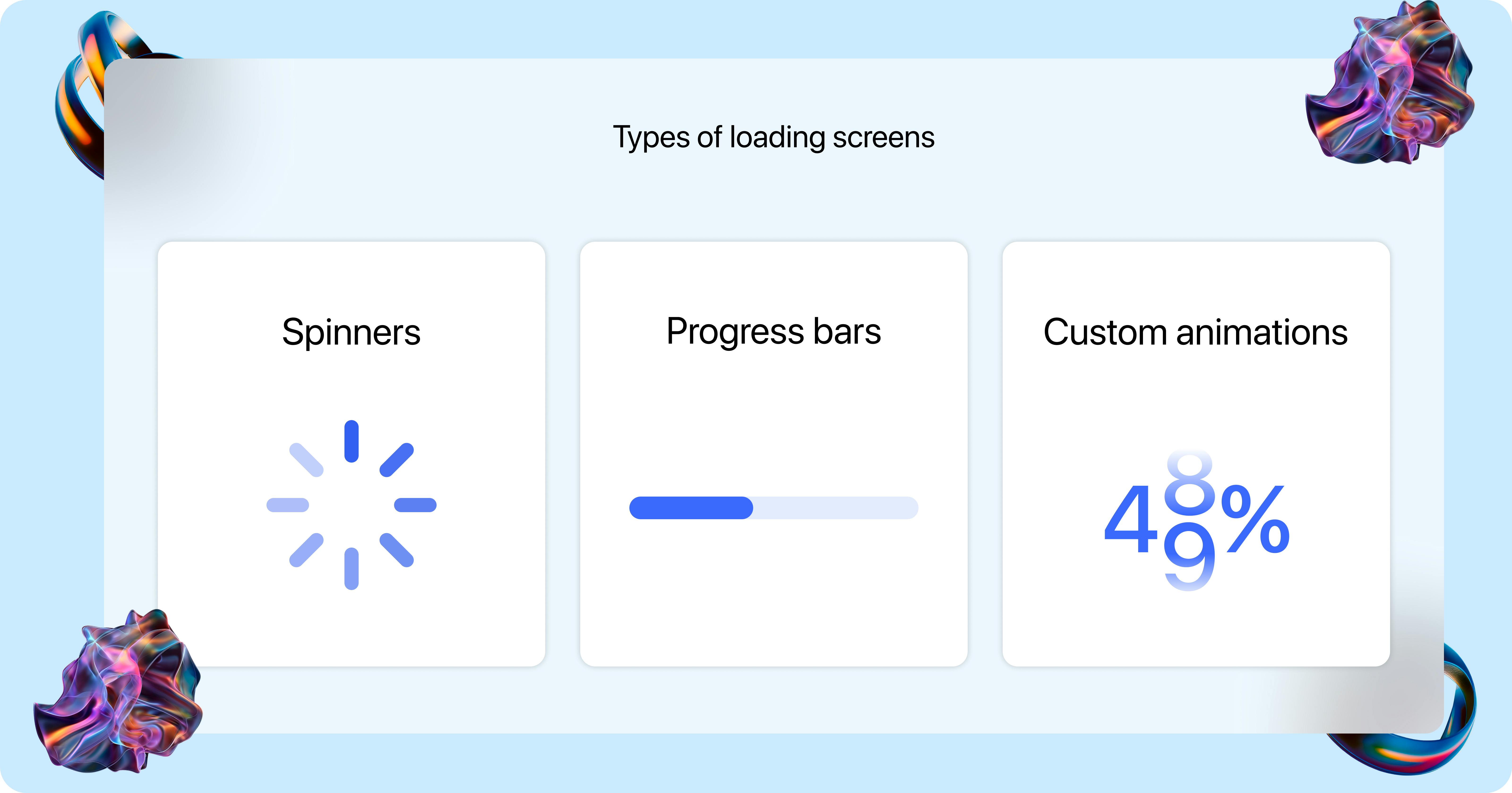
Loading screens are primarily divided into three based on their visual indicators and functionalities. While they all serve the same purpose of maintaining user expectations, maintaining user engagement, and providing useful feedback, they do it differently and with different graphics. Could we possibly dive into each?
1. Spinner loaders. These are animated icons that show the loading progress through the gradual fading of progressive icons in a circular motion. They include and are not limited to icons, shapes, or even small graphics.
2. Custom loading animations. These are creative animations that engage users while content loads. They include and are not limited to stretchy text, animated text, colliding elements like circles, loading percentages, color changes, etcetera. Their creative approach makes them unique.
3. Progress bars. Visual representation of the progress of a process is often displayed as a gradual filling bar to represent the completion or near completion of the process. The bar at the start is often only a stroke but as the process progresses, it feels with a dominant color.
Benefits of loading screens
1. Improved user experience. Loading screens give visual feedback to users, indicating that their needs are been taken care of, which helps maintain user expectations and improves the user experience in turn.
2. Enhanced perceived performance. Loading screens create the illusion of a shorter wait time, thus improving the user experience and making the waiting time feel shorter than it is.
3. Improved user frustration. By informing users about loading processes and their progress, loading screens prevent frustrations and agony that may arise from perceived delay, reducing the risk of users leaving.
Implementation best practices
1. Attention diversion. To reduce perceived waiting time and improve the user experience, designers should use loading animations that divert the attention of users like progress bars and percentage loaders
2. Effective design. To ensure that loading animations positively contribute to the user experience and fit into the context, design loading screens that are effective.
Comparison: Skeleton vs loading screens
As with everything, when to use something and when to stay away from the same is crucial. The same applies to the skeleton and loading screens. When used in the wrong context, the results are catastrophic and may mean the end of the website or app. Let us look into situations when we should use each and when to stay away.
When to use skeleton screens
1. Content-heavy modals. Skeleton screens are recommended for use in websites, web apps, apps, and tools where a lot of data needs to be fetched. For models that contain a lot of images, CTAs, paragraphs, and image carousels skeleton screens are recommended.
2. Full page load. For full page load, skeleton screens are recommended as their wireframe nature gives the users a preview of what to expect and where, this reduces the anxiety, and agony while enhancing the user experience.
3. Maintain visual context. When you want to maintain visual context, skeleton screens are the go-to as they give the user a preview of what to expect and where.
When to use loading screens
1. Specific content type. When your gifs need to load large videos or animations, then loading screens is the best. Spinners are the best for this type of content.
2. Single modules. Loading screens are the best when you want to load things like videos, cards, or gifs on a dashboard. Their progress-indicative nature gives the user an estimate of how long to wait for till the loading is done.
When not to use each
1. It is advisable to not use spinners to load videos as that is often associated with buffering and it is not a good look for your site.
2. For file conversions, uploads, and downloads, don’t use skeleton screens, instead, you should consider progress bars.
3. It is also advisable to stay away from skeleton screens if the loaded content is mismatched from the preview of the skeleton screen as this confuses the user and ruins the user experience.
4. For sites that load quickly, it is advisable to stay away from both, as they only add more unnecessary layers to your site and end up ruining the user experience.
Conclusion
In conclusion, the decision to use either skeleton screens or loading screens should be based on specific loading context, loading speed, and desired user experience outcome. They are both great, but each has specific use cases. Skeleton screens should be used in heavy-content modules, full-screen loaders, and when you want to maintain visual context, while loading screens are best when loading single modules, for quick loading content, and specific content like videos, uploads, and downloads. By understanding the specific use cases, strengths, and limitations of each, designers can design interfaces that manage user expectations, improve the overall user experience, and enhance user engagement during the loading state.
Further reading
Are loading screens more important than they appear to be?
Everything you need to know about skeleton screens
What Are Skeleton Screens? (And Do They Work?)